SQL for calculating Churn, Retention & Re-Engagement

Posted by Jeff Dwyer

Feb 22, 2015 10:32:00 PM

Churn rate. It's probably the most important usage number you could have, but boy is it a pain in the butt to calculate. Or is it?


For ForceRank.it we don't have a ton of traffic so we've still got a simple table of events, where event is something like "login" or "pageview". Whatever your database though I think it's likely you have a table that can function like the following:


So what are the steps we need to do to calculate monthly churn?

1) Figure out how many people used the application each month.
2) For each month, figure out how many of those people did or didn't use it the next month.

So step 1 is trivial, right?
That was easy... but now we're in trouble. We've got the number of active users, but we've lost who they were, so now we can't compare to the next month.

At this point it's easy to end up trying
  1. Join the table to itself, which is described here but this can get impossibly slow as they explain here.
  2. Say to hell with it and solve for one month at a time and put that in a cron job, and save it to a new table.


The Problem with Cron

The cron job works, but the sad thing about it is that now we've got a table of churn numbers, but we're locked in and can no longer segment. How do paid users retain vs free users?  Sorry, you're going to need to refactor this whole solution.

Enter Window Functions

So is there any way to do this in one fell sql-swoop? The good news is that there is, brought to you by window functions and lag() lead() functions in particular. .


Lag & Lead mean that we can iterate over results, comparing our current row to the next row. This is huge, particularly because we can partition by user. Lag and lead are available to you if you're using PostgreSQL, Redshift, or pretty much anything except MySQL


Let's see what this means in practice.

1) Who used it and what month they used it. To make things easier on ourselves later, lets represent the month as "number of months since 1970" so that we have a simple monotonically, increasing number.

logins by month

2) For each row in #1, what is the next and previous month they used it, partitioned by user.

logins by month compared to lead and lag

Ooooo!!!! Now we're getting somewhere!

3) For the results in 2, what's the difference between our current month and the next month. If it's one, then we know that the user came back the next month. If it's two or more, then we know there's a gap! That's a churn!


This table has everything we need to know!


4) Case statement the various possibilities. As an extra, we now have great insight into whether we are getting "revived" or "return" users.


5) There's some final cleanup and UNION of the two different data sets before we're done. You can see this in the complete query below. Basically we sometimes have >1 important row (ie the churn and the active) per row, so we double query our calculated table and union the results. But voila! We've got a single query for churn/active/return/new users.

Final Results after a quick Excel import and Pivot Table:


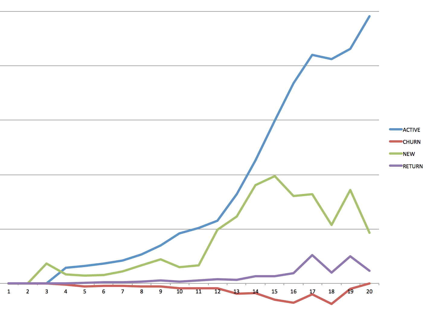
In summary, the above sql is a super useful way to get user activity data out of your database. Because it's a one stop query, it's really easy to add additionally filtering or grouping to this query, meaning you can easily segment these results.

ps   Performance 

Oh right, and how does it perform?  Well on Redshift anyway cranking through 60Million rows takes about 7 seconds. In PostgreSQL I've haven't tried it on anything that large but it's never given me a problem.


Curious about what we do here at ForceRank? Give it a try!

Try ForceRank Free

more

Topics: Tech, sql

Prioritze Your Trello Backlog

Posted by Jeff Dwyer

Jul 14, 2014 12:29:00 PM

The only problem with Trello is... 

Trello is one of my favorite tools on the web. So many other collaboration tools turn the very act of putting together a TODO list into something that feels like filling out your TPS Reports, but Trello feels so lightweight that is is often "just-enough-process" for even a large product development team.

The only problem is that it's so easy to add items that it's easy to end up with a "Backlog" list that goes from 5, to 10, to 25 items and eventually it turns into a total junk drawer.

JunkDrawer1

One solution is to nuke the list from orbit, but that can be overkill and it's sure scary to nuke a list with that includes cryptic cards like "fix issue with missing data" or "fix security". Still, something needs to be done to separate the wheat from the chaff. What we need is a really quick way for people on the team to share their opinions about which cards are most important.

New Trello API Integration

I'm super pumped to show you ForceRank's new Trello import. With one quick click you can turn a big list of cards into a rankable list, upon which the team can quickly vote. Once that's complete, BOOM! You've got the wheat on one side and the chaff down at the bottom. Let's check it out in action!

Step 1: Find a List You'd Like to Prioritize

Screen_Shot_2014-07-13_at_6.58.38_PM

Step 2: Create a New Question in ForceRank

A free account will work just fine. Then you just click "Import from Trello".

Screen_Shot_2014-07-13_at_6.57.14_PM

Step 3: Select the Board and List

Trello will ask you to authorize ForceRank and then ForceRank will show you a list of all your Boards and Lists.

Screen_Shot_2014-07-13_at_6.57.29_PM

Step 4: Name Your Question

Screen_Shot_2014-07-13_at_6.58.04_PM

Step 5: Drag and Drop to Prioritize

Screen_Shot_2014-07-13_at_6.58.14_PM

Step 6: Share and Compare

Then just share the link with your team and they can easily vote as well. Once you've voted, you can compare the overall results and dig deeper into any disagreements with the comarison tool.

Screen_Shot_2014-07-13_at_7.31.30_PM

That's it! I hope you'll give it a try and let me know whether this is useful for you. For other ideas about how to use ForceRank for product management check out But What Is The Minimum Viable Product.

Happy Trello-Taming!

Try ForceRank Free


more

Topics: Tech, Product Design

Post Natal Part 5: Homepage Design Iteration Examples

Posted by Jeff Dwyer

Jul 14, 2014 12:28:00 PM

This is part of our "Post-Natal" series on the development of ForceRank.it see Building ForceRank.it for the rest of the series.

So I'm sure we can all agree that the homepage is pretty important. It's the one thing people are guaranteed to see. It needs to load fast and then you've probably got 1.7 seconds to tell people what you're about.

Oh and most people don't read the words.

If you haven't already read it, How I increased conversion 2.4x with better copywriting is Amy Hoy's fabulous how-to on homepage design and I totally subscribe to her philosophy. My takeaway from her piece is that the homepage should tell a very clear, quick, focussed story. Do NOT start with features. Start with the problem. Dive deep on the problem. If readers can tell that you understand their pain, they'll give it a go even if they don't understand your solution. If they just see features & pricing and a testimonial you make them do all the hard work of figuring out whether this solution is right for them.

So with that in mind, let's see what we actually came up with. (You'll see a big Hoy-style rewrite about 4 revisions down).

Iteration 1: Too focussed on the product

This was close to placeholder, but it's worth looking at to see where we started. I did a lot of hand-wringing about the difference between "Decision Tool" and "Opinion Comparison". You'll see that I flop back and forth between "Simple Group Opinion Comparison" and "Group Decision Making" throughout these iterations. The reason is that I HATE the idea that a tool would make a decision for you. That's just a horrible idea. ForceRank is supposed to improve communication. But that sounds a little wishy washy and "Decision Making Tool" is about 300% easier to read than "Opinion Comparison Tool".

The second theme in here is explaining the "Force" part of ForceRank.it. ForceRank is unfortunatey a word with a very unhelpful connotation to Jack Welch's Vitality Ranking which is a way to rank employees reward the top 20% and then cut the bottom 10%. I wanted to make it clear that that's not what we're doing here because I think the demand that things be ranked is a great feature of ForceRank.it Since you can't have two #1 priorities you are forced to make hard choices. The bonus of making these hard choices is that I think it makes you more empathetic towards the eventual decision maker. Too often I see situations where each stakeholder wants their project #1 and has no sympathy for the eventual decision. 

Screen_Shot_2014-07-05_at_6.49.49_PM

Screen_Shot_2014-07-06_at_4.47.25_PM


Screen_Shot_2014-07-06_at_4.47.35_PM

Iteration 2: Make it interactive

This was a great idea that I got from Maggie Steciuk. She just kind of mentioned it in passing but I really liked the idea of letting the user actually play with the thing without signing-up.

Part of this stems from the fact that we have an enormous onboarding challenge. Rarely are people walking around wishing for just exactly the kind of solution that you've created. But this leads to a real difficulty when getting people started. In every user test I did, I got huge positive feedback about the idea. People were really jazzed about the potential and said they absolutely felt the pain I was describing. But then when they land on the "Create your first question page" everything grinds to a halt. What problem should they do first? Hmm. What are the possible choices? Those aren't easy questions and that's fine, but it also means that task #1 is a serious time commitment from your user and that's not great.

The idea with interactive homepage is to give people a bit of the payoff/reward of ranking and comparing results with a dummy set of data. The user tests I did of this were positive. People seemed to have a much better sense of what the product could do for them. That said, it definitely didn't fully solve the issue of bootstrapping them.

Screen_Shot_2014-07-06_at_4.54.44_PM

Iteration 3: Personas

I think one of the best things about ForceRank is that it can help even out the playing field between introverts and extroverts, people that dominate meetings and people that prefer email. Hopefully the tool can provide a way for introverts to contribute ahead of time, while providing a great jumping off point for the meeting itself. I write a bit more about this in The Personality Zoo: Meeting Zoology.

As part of that I wanted to give people personas to resonate with, so we made some nice personas.

Screen_Shot_2014-07-06_at_4.59.58_PM

 Iteration 4: Cave in and call it Decisions

As mentioned above you can see here that I've axed the confusing "Group Opinion Comparison" wording. Starting to get a bit Amy Hoy-ish. Do you see anything about what the product "does"? No, you don't. Describing the pain.

Also Mike convinced me that the picture of my couch was lame.

Screen_Shot_2014-07-06_at_5.06.30_PM


Iteration 5: The Full Amy Hoy

Allright, this is my pass at a full "describe the problem" long form homepage. I get a little crazy with icons. And I go on a bit of a rant about how this is not groupthink. I'm trying to avoid the "This Tool Will Make Your Decision.

Also I brought the couch back because I have no taste.

homepage_10_6

 Iteration 6: Simplify. Simplify. Simplify.

 Watching users read the previous page it was obvious that they didn't, well, read the previous page. This iteration relies heavily on the idea that the interactive parts of the tool are going to show exactly what we're doing. And it hopes, (possibly incorrectly) that the quick hits on top are enough to describe the problem.

Also more CTAs and I finally decided that couch needed to go.


homepage_1022


Iteration 7: Long Form

I wrote a blog post But What Is The Minimum Viable Product? which was pretty popular so I had some much better screenshots of use cases. I've always liked long-form pages as well. They seem like they do little harm for people that are ready to convert. I think short-short-short homepages have great click thru, but I've seen in AB tests how easy it is to increasing the click thru rate of the homepage and end up with those people just falling out of the funnel one step later because they're not a good fit. Since ForceRank takes some work to setup your first question, I'd rather pre-qualify people then make them click through into a hard task just to understand what the product does. Make sense?

homepage_2014

So that's the current state of the homepage (at least before we unveil our super awesome new integration). What do you think? I'd love to sit back and hear about the multitude of ways in which I screwed this up.

You can read the rest of this series in Building ForceRank a retrospective about the entire process. 

Try ForceRank Free

more

Topics: Tech, Product Design

Post Natal Part 3: Technology Decisions: Why Rails is still great

Posted by Jeff Dwyer

Jul 14, 2014 12:28:00 PM

Happily, figuring out what tech we'd use was a very very small part of the ForceRank build out. We'd both used Rails in a previous life and our return to the fold was smooth sailing. Things have only improved since we left.

Screen_Shot_2014-07-14_at_9.37.01_AM

Here's our Gemfile. Pretty plain vanilla. But since breaking up with Rails seems to be the thing to do these days I thought it important to express just how fabulous our experience has been.

TurboLinks is fabulous. Not seeing the page flicker everytime you click a link just feels fantastic. I don't have numbers to prove that this has helped us, but every study ever done says that perceived website performance is the most important thing and I think this really helps us.

 resized_business-cat-meme-generator-code-in-java-be-an-enterprise-hipster-a39e0b

Hipster Coding

Well, we didn't actually go so old-school as Java, but with Rails being so passé, we felt like hipsters the whole time. Honestly though, for our use case "Post the form and redirect" felt like the newest hotness since AJAX (turbolinks is of course really important to make this feel good). Remeber the original DHH Rails video? "Look at all the things I'm NOT doing!" I felt like that the whole time. Look at me not compiling jade templates into javascript. Look at me not builing a parallel universe of Backbone models on the front end. Look at me getting totally sane error handling on forms out of the box by just using simple_form. Look at me not reading Ember documentation!!

Look at me not writing ANY authentication/user-management code because Devise just works.

Look at me styling a responsive site even though I am garbage at CSS because Foundation is fabulous.

Look at Stripe just being the most mind-blowingly developer friendly service you can use.

Look at better_errors just being embarassingly useful.

Look at letter_opener solving a problem I remember spending tons of time on in an earlier life.

Oh and Heroku. Yeah. So good.

As far as Heroku addons are concerned, HelpScout in particular seems to have fit the bill. Just seems to work. We tried Intercom and MixPanel, but you get into pricing tiers that are unaffordable very quickly.

Anyway have a peek a the Gemfile. Consider bucking the trend and not building an enormous single page app. If you're trying to solve a user's problem this basic Rails stack is the right answer for many many things.

Tame Your Trello Backlog

more

Topics: Tech

Ugly Mockups: How We Started

Posted by Jeff Dwyer

Jul 14, 2014 12:28:00 PM

This is part of our "Post-Natal" series on the development of ForceRank.it see Building ForceRank.it for the rest of the series.
Why Create ForceRank talked about the problem we were trying to solve with this product. So how did we think we'd actually do that? How do you turn an idea into a reality? Here were our big goals.

KISS

The site should be simple. Simple. Simple. One focus. No bells and whistles. We are big admirers of Doodle.com and we wanted it to feel just that easy. This lead to our second goal.

Get to Dog Food

Only build features that you must have in order to get as quickly as possible to the dogfooding stage. 

Mobile First

This is an interesting one, because honestly we get much less mobile usage than desktop and you could say that making everything work in mobile was a waste of time. But I would absolutely do this again. The fact is: if your design is simple enough to work well with one thumb your design is simple enough to work. Embrace the constraint.

No No's

Starting in our spare time we wanted to make sure that we didn't put anything in the way of forward progress. That's why we instituted our policy of "No No's", which means that the answer to "can I ..." is always yes. "Can I rip out the pricing page you did and totally redo it?" "Can I change the company logo?"  "Can I publish this blog post?" The answer is always yes.

Ship Early

Pretty much the current dogma, but it's dogma because it's right. Scratching one's own itch certainly helps in this regard because it means you can overlook lots of potholes as you try to solve your problem.

Charge Money

This is no doubt controvertial for some and we've already got great feedback from some people which basically amounts to "omg this is great! why are you hobbling yourself my charging money for this? this could be huge!!" But the fact is we aren't aiming for huge. We're aiming for really frigging useful. I don't want to solve anything remotely related to scale unless it's clear we've solved the fundamental problem first.

So how do you actually start? 

Well, you Sketch some things. And let these sketches be ample proof to all that you don't need a designer on day 1. Look at that horrid gradient! Look at those misaligned edges! No big deal. 

Screen_Shot_2014-07-06_at_5.20.58_PM

Mobile First: The trick with responsive design

You can see some horrible mobile-ish design in that first screenshot. It's horrible, because honestly I stopped using Sketch pretty early on. One thing I found was that responsive design was really much much harder in Sketch than just doing it live in HTML with Foundation. Responsive is just it's own thing. Maybe real designers have better tricks about how to think about the same design in 3 different widths at the same time, but it made my head hurt and doing static mockups in HTML and then dragging the window around to see how it responded felt so much easier. 

That said, Sketch was great about helping me understand how the voting and reports pages would work. 

Screen_Shot_2014-07-06_at_5.21.10_PM

The voting page

Pretty straight forward. A couple learnings here:

  • I really preferred a "drag from left to right" to a "re-order this list". It was more of a PITA, but if the list has any default order, everything is suspect of bias.
  • Ordering of choices was going to need to be randomized so we wouldn't insert the same bias for all respondants.
  • Left to right dragging was going to be hard on mobile. Honestly I wasn't sure what the solution would be it seemed like something we'd just have to try on the phone.
  • This design meant people wouldn't need to vote on all options. Was that ok?


Screen_Shot_2014-07-06_at_5.21.15_PM

The report page

This was probably the most important page to get right. If you ask three coworkers to vote on their priorities, you'd better deliver something useful. As you can read about in Why Build a Saas? I'd used color to help pull out the discrepancies between responses in my spreadheet. What wasn't clear to me, without mocking things up, was whether this was going to work at all for larger groups.

Should we show each choice in the order of the overall results, then what ranking each voter gave the choice?

I decided that was confusing, because there was no way to see the rankings of each individual. Instead I hit upon the solution you see above. Show each user's rankings in the order they ranked them. But use the color coding from the overall results.

I think this works pretty well. The "You" vote for "Level 0 - Level7" above clearly jumps out as being an outlier. Also the grey boxes work to show that Maureen didn't vote on everything.

Continue reading the rest of this "Post Natal" wrap-up here: Building ForceRank.it 

Try ForceRank Free

more

Topics: Tech, Product Design

Counting Votes Is Hard

Posted by Jeff Dwyer

Feb 9, 2014 1:22:00 PM

It all started one day when we tried to count the votes.

So you know how ForceRank.it works right? Your group ranks all the choices, then we add up how many points each choice gets and boom, we show which choice is the most popular.

Right?

Well, it turns out that this is one of those cases where "the obvious way" can produce very unintuitive (and hence arguably "wrong") results.

How is that possible?

Let's see an example. This is a poll that one of our users created to figure out what topic should be the subject of his tech talk. Give it a quick look and you'll see that three out of four people had the same first choice. So picking a winner should be easy right?

Screen_Shot_2014-02-09_at_12.43.23_PM

But that's not what happened. 

The first version of our algorithm picked "Mapreduce and KIR" as the winner. How is that possible you ask? Well, let's do the math together and add up how many points each option should get. I'll highlight just those options below.

Screen_Shot_2014-02-09_at_12.45.29_PM

So with 9 options each, "Mapreduce and KIR" gets: 9 points from Matt, 7 from Jessica, 8 from James and 6 from Greg, totalling 30.

And Newbie HBase gets: 1 from Matt, 9 from Jessica, 9 from James and 9 from Greg, totalling 28.

Hrrmph

We dubbed this the "Matt Ball" effect, but the more canonical description is that our algorithm has failed the "Majority Criterion", which states: "if one candidate is preferred by a majority (more than 50%) of voters, then that candidate must win".

So what did we do?

Well, we went to the wikipedia and dug into Voting Systems. Unsurprisingly it turns out that there's been a lot of high quality thinking on this subject. We looked into a number of methods and the one that seems like it is the best fit for ForceRank was Schulze Method. In a nutshell, Schulze breaks down the voting into a ton of mini ranking between each combination of options, what they call a "pairwise-analysis". Next it does a neat bit of graph magic to pull out a series of winners.

The result, is that it is guaranteed to ace the "Majority Criterion" (which our previous method failed) and a number of other conditions as well.

The only real downside is that Schulze method is a bit more difficult to explain, but at the end of the day it delivers an answer that feels much more intuitively like the "fair" winner of a vote.

Screen_Shot_2014-02-09_at_12.56.07_PM

Next Up?

Next on our list is building in ways to see the patterns in your group's rankings. There's a lot of really interesting information to be gleaned from the data that ForceRank provides and it's our goal to help you get a quick and easy to comprehend understanding of the complex nature of your groups preferences, and the outliers within.

Try ForceRank

more

Topics: Tech, Decision Analysis

Upgrading from Zurb Foundation 4 to Foundation 5

Posted by Jeff Dwyer

Nov 22, 2013 6:31:00 AM

Screen_Shot_2013-11-22_at_5.51.18_AM
I'm a big Foundation fan, so I was pretty excited to hear that Foundation 5 has been released. I'm most of the way through the upgrade but it certainly wasn't bump free. 

Here's what I've learned:

There's a new gem in town

Screen_Shot_2013-11-22_at_4.18.17_PM

Application "Bootstrapping" is cleaner

Screen_Shot_2013-11-22_at_4.18.05_PM

Pluralization is no longer cool

Screen_Shot_2013-11-22_at_6.03.18_AM

Your TopBar needs a new data attribute

Screen_Shot_2013-11-22_at_6.04.46_AM

Custom-forms is dead

Screen_Shot_2013-11-22_at_6.07.00_AM

You MUST Have application JS loaded inside the <body> tag. Not the <head>.

Otherwise I got a very unfriendly error about Layout needing to be a layer from FastClick 

You probably need data-turbolinks-eval => false

Since I had to move the application.js from the head to body it was now loading everytime I changed from page to page via turbolinks. This fixed things. 

Screen_Shot_2013-11-22_at_6.09.15_AM

Changing your foundation_and_overrides is a PITA

I don't have a real solution for you here. Besides the fact that this was a pita. A lot has changed, such as:

$h1-font-size: rem-calc(44) !default;

Which is now in rem's instead of em's. This broke for me because rem-calc was not defined until I moved @import "foundation/global" to happen earlier.

I general, the difficult thing seems to be determining what constants names have changed.

Overall, things are starting to come together:

Before:

Screen_Shot_2013-11-22_at_6.22.04_AM 

After:

Screen_Shot_2013-11-22_at_6.22.25_AM What do you think?

Try ForceRank

more

Topics: Tech


What is ForceRank?

ForceRank is a prioritization tool for product managers. It helps people identify priorities, make tradeoffs, compare results and finalize a plan.

Try ForceRank

Recent Posts

Recent Posts

Follow Us