This is part of our "Post-Natal" series on the development of ForceRank.it see Building ForceRank.it for the rest of the series.
So What Does Product Development Look Like?
Sept 6th Day 0
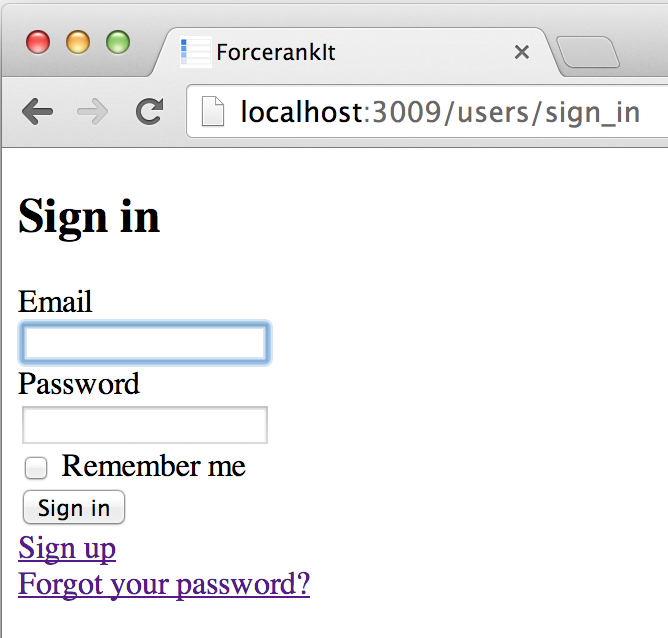
Login and a hello world. NBD, until you realize that out of the box you've got password reset emails, user creation, remember me etc, all running live on Heroku. 2014 is awesome.

Sept 7th Day 1
Installed Foundation by Zurb so out of the box have a nice nav, which is responsive and works on mobile.
Also static mockups of the voting screen. You can see the mock in Early Designs. The nice thing about getting this in HTML quickly was that I could start seeing what was going to happen on mobile, which was a concern because of the "drag left to right" design.


Sept 9th Day 3
Report page mockups finished. All of this is still static. Work is proceeding on the backend as well, but it was easiest to just plow ahead on the front and worry about hooking things together later.


Sept 18th Day 12
Work really only happening on weekends and still you can see that by day 12 we've got a functioning system. Real voting. Real rankings. I'd say that we'd spent about 30 hours so far.


And looking good on mobile. You can see in the third screenshot that I've cut out the comparer tool from mobile. This seemed like a fair tradeoff to me. Data-entry needs to work on mobile because you're going to receive an email asking you to vote. But data analysis can wait for the big screen.

So that's it! Two weeks from drawings to functional prototypes. Our next step was to stop coding, get out in the field and watch some people try it.
You can read more about how they liked it and what we did next in The Building of ForceRank.


