As Forcerank surpasses 100,000 votes, we’ve been diving deep into user behavior to understand how people leverage our platform, and the insights are crystal clear! Talking to customers a significant trend has emerged from our research, revealing that a whopping 22% of all questions are centered around annual planning and prioritization. When we add quarterly planning and annual budgeting into the mix, more than one-third of all the questions on Forcerank are focused on the most critical issues that our organizations face—what truly matters most.
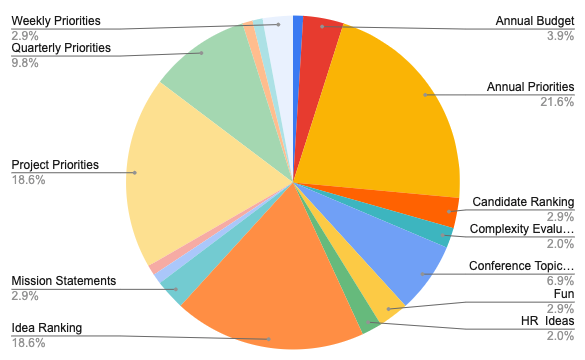
Here’s a breakdown of the top categories on Forcerank:
- Annual Priorities (21.6%): Leaders are continually using Forcerank to ensure they stay focused on their biggest long-term goals.
- Project Priorities (18.6%): Deciding which initiatives to tackle next can be a challenge. Forcerank helps users cut through the noise and focus on projects with the most impact.
- Idea Ranking (18.6%): Got a ton of ideas floating around? Forcerank’s intuitive ranking system ensures that the best ones rise to the top.
- Quarterly Priorities (9.8%): Breaking down yearly goals into actionable quarterly steps is where planning meets execution.
- Conference Topics (6.9%): Companies are using Forcerank to align on themes and topics for their most important gatherings.
- Annual Budgeting (3.9%): Budget allocation is key to organizational success, and Forcerank is being used to make these financial decisions clearer.
While these are the major players, other notable categories include Mission Statements, Weekly Priorities, and even Complexity Evaluations—showing the versatility of Forcerank to handle everything from the highly strategic to the tactical.
Unlock New Ways to Use Forcerank in Your Organization
As you can see, planning and prioritization dominate Forcerank activity. But that’s just the tip of the iceberg. Let’s explore some of the cool ways Forcerank can help your organization make data-driven decisions, fast.
1. Streamline Strategic Planning
With over 1 in 5 questions related to annual priorities, it’s clear that users rely on Forcerank to focus on the “big picture.” Whether you’re planning for the upcoming year or rethinking your long-term objectives, Forcerank can help your team rank strategic goals based on collective input, ensuring alignment from top leadership down to individual contributors.
2. Tackle Project Overload
When you have too many projects on the table, Forcerank helps to sort through the chaos. By gathering input from across the team, you can identify which projects should be prioritized and which ones can wait. No more endless debates about which initiatives are truly essential!
3. Budget with Confidence
Allocating budgets can be tricky, especially when everyone has a different opinion about where the money should go. Forcerank’s annual budgeting category gives your team a platform to weigh the pros and cons of each spending area, ensuring that funds are allocated to the most critical needs.
4. Optimize Conference Planning
Getting everyone on the same page for big events like conferences can be daunting. Whether it’s deciding on the main themes, speakers, or breakout sessions, Forcerank gives you the power to engage stakeholders early and reach consensus efficiently.
5. Evaluate New Ideas
Forcerank is not just about planning and priorities. With almost 20% of votes going to Idea Ranking, it’s also the perfect tool for innovation. Let the best ideas from across your organization surface naturally, ensuring that everyone’s voice is heard and the most impactful ideas are pursued.
6. Assess Candidates and Complexities
From ranking candidates for key positions to evaluating the complexity of new projects, Forcerank can help you navigate hiring decisions and project feasibility with objective, data-driven results.
7. Enhance Fun and Culture
You might not expect it, but 2.9% of votes relate to topics just for fun! Forcerank helps teams stay engaged by offering a platform to rank fun ideas, team-building events, and cultural improvements, showing that it’s not all just work—there’s time to foster company culture too.
The Takeaway
Forcerank is more than just a ranking tool; it’s a platform that helps organizations align on their most critical decisions, from long-term strategy to budgeting, from project management to innovation. The data shows us that prioritization is top of mind for many of you, and Forcerank is the best way to ensure that your team’s priorities are not just set—but agreed upon.
As we hit 100,000 votes, there’s never been a better time to explore all the ways Forcerank can transform how your team approaches decision-making. Whether it’s for strategic planning, project prioritization, or sparking new ideas, Forcerank puts the power of collective insight in your hands.
Are you ready to make your next big decision with confidence? Start using Forcerank today and watch your team’s priorities come into clear focus.